Your podcast artwork is your podcast’s most memorable asset, so make it count.
Your podcast square is the visual identity of your podcast. You want to make sure your artwork stands out on a small screen and on any browse pages, but also completely encapsulates your show. But how do you do that?
You follow our 5 simple rules to get you on track:
- Be Bold
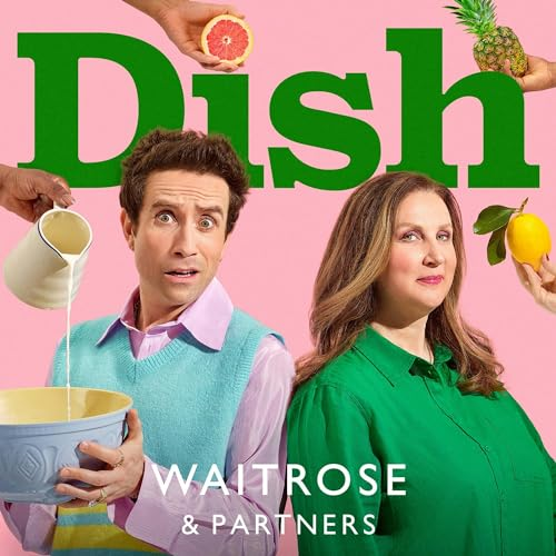
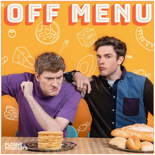
In a huge sea of thumbnails, you need to make sure your podcast speaks for itself. Vibrant colours and clear, legible fonts are one of the many ways of doing that. You want to make it bright and bold, without colours that clash or make it hard to read your show artwork. If you think that putting in tiny details will make your artwork stand out – think again. Your artwork will most likely be quite literally the size of a thumb nail, so instead put effort into making it look good when it is seen on a small screen.
Example of clear and bright artwork that stands out:
- Feature Faces
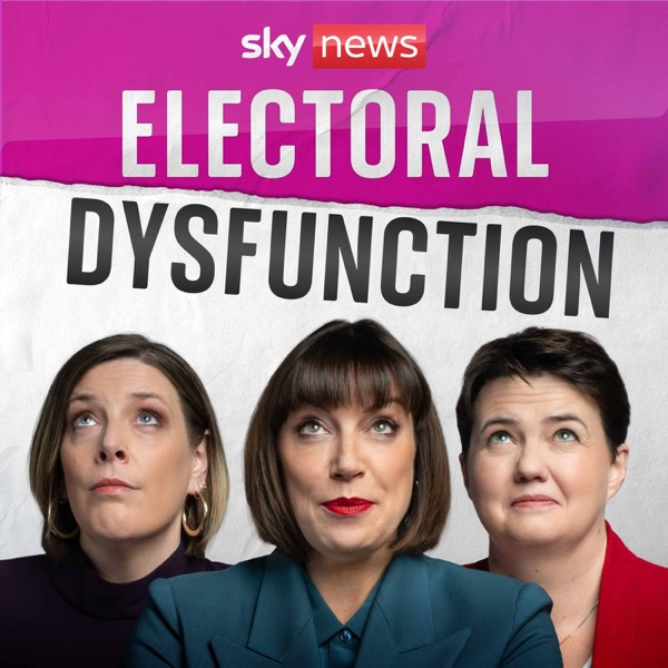
If you have a host for your podcast that your listeners might recognise, make sure to feature them. Don’t compromise on size here either, you want to make sure their face is clear and recognisable no matter how small the artwork is. Listeners are more likely to find a connection to your show if they see the host’s face too, so use them to your show’s advantage.
Example of clear artwork that features faces:
- Grow Your Artwork
By that we mean: create artwork that can then morph into other visuals for social platforms and/or any other formats. You want to have elements of your artwork be visible on your video, social content and your website – so think about how you are able to connect all of your assets to make them fit. Plus, don’t forget about the Hero artwork on Apple and episodic artwork too!
Episodic artwork:
- Make it Clear
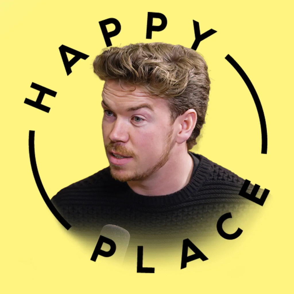
By far the most important – make sure your listeners can clearly read your show’s title. Sometimes choosing a funky font (or coming up with your own) is fun, but might not actually be what’s best for your podcast. Try to avoid any excessive text that would be hard to read scaled down, or any other intricate details that would be cluttering your square.
Instantly recognisable podcast artwork:
- Reflect Your Identity
Your podcast serves many functions, and a huge one is being a representation of an idea or an answer to a question a listener might have. Whether you are a personality-driven show or a docuseries, you need your podcast artwork to reflect your brand. This could be more serious for news organisations and bigger publishers, or more playful for independent podcasters – but do keep in mind the kind of image you are fostering and what brand recognition would mean to you.
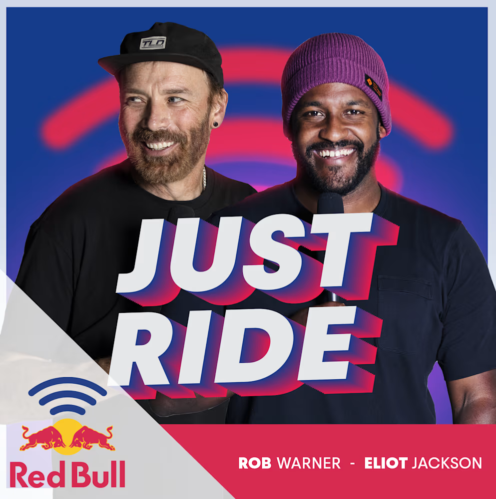
Example of a Red Bull branded show that adheres to the brand:
Remember: podcast artwork is very much like a book cover. You might become recognisable just from your artwork alone (and we hope you do!), so putting in the proper effort and time to make it look how you want to is very much worth it.