
Get new listeners by creating clear and exciting artwork for your show
Artwork and titles are often the main reason that a new listener’s going to try out your show – so you need to make them count. First impressions matter, especially online, and you want your podcast to stand out on any browse page. So here are some of the do’s and don’ts when creating your artwork:
DO MAKE IT BOLD: Clear and bright artwork will always stand out vs. a muted and low-key design. It’s important your artwork fits with the theme and genre of what you are talking about, but it is also important it sticks in people’s minds and stands out on the (podcast) page.
DON’T USE PODCAST TROPES: There’s no need to waste space in your artwork by communicating that it’s a podcast – so skip the pictures of headphones and the mics.
DO KEEP IT SIMPLE: Think of the first five words to describe your show and use those to create your artwork. Keep it consistent in all your branding, and avoid abstract or ambiguous design options. Plus, check what your design looks like when it is tiny on a phone screen – can you read it? If not, it might be best to redo.
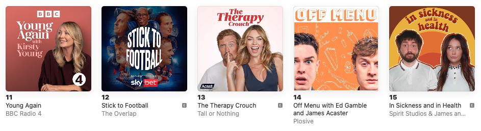
DO TRY TO INCLUDE FACES: People like people – communicate that your show is personal and relatable by including images of the people who host it.
DON’T FORGET EPISODIC ARTWORK: Most of the main podcast apps now show episode artwork in some of their browse pages. You can attach these to your episodes in most podcast content management systems. Try and come up with a design that reflects you main podcast square – but then personalises it for each episode. You could have pictures of guests or imagery based on the theme.
DO CREATE A PODCAST IDENTITY: Once you create your main artwork, make sure to use the colours or imagery from it across your other branding for the show. This could include your website and any social assets or video. So if you’re commissioning a design ask for different widths and types, not just the square.
DO CHECK IF YOUR ARTWORK LOOKS GOOD SMALL: Remember sometimes your artwork is made very small on some of the apps – does it work if squished down? You can preview it using Only Pod.
DO LOOK AT THE PODCAST GUIDELINES: Make sure your artwork meets the guidelines from people like Apple and Spotify. For example Apple requires the size of your square to be between 1400×1400 and 3000×3000.
But most importantly, don’t forget to make your artwork yours! You want to enjoy looking at your show on any app or social media page (because you will be doing it a lot), and having something you love will definitely make you want to do the best job to make the content of your show outstanding.